UI/UX Case Study-Disney Hotstar
Improvement to get better experience.
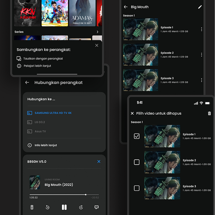
Disclaimer:
This project is based on challenge at Binar Academy. This project was carried out by six people who were divided into the Project Management Team (PM) & the UI/UX Team. Also Mixed languages (English and Bahasa Indonesia)
Background
Disney+ Hotstar is a streaming service dedicated to showing the biggest international and local hits, all in one place. The services available range from favorite series, Hollywood blockbuster movies, exclusive content from Disney, Marvel, Star Wars, Pixar, National Geographic and many more, as well as local Indonesian films.
Main feature:
- Subscribers can watch on two screens at the same time on mobile, desktop or on select Smart TVs.
- All shows are available for download, so you can watch them on the go.
- Ad-free and hassle-free service.
Problem
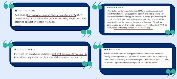
We collect data through the review rate of the disney hotstar application with the aim of collecting some users feedback that we will try to solve.
Tools:

Design Process

To resolve this case, we chose to use Design Thinking as our approach to design process. This process consists of:
1. Empathize
This is the stage to determine and analyze who the user is, what problems are experienced, and find out the needs of the user.
There are two methodologies that used for this UX research:
- In-depth Interview (Qualitative): To know the behavior, personality, needs and pain points when using Disney+ Hotstar and also to validate user feedback.

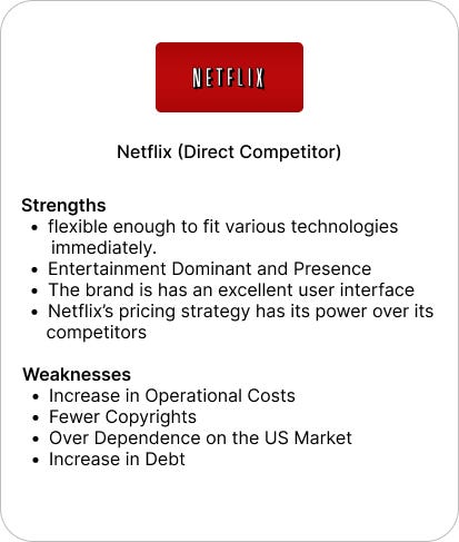
2. Competitor Analysis: Getting know about other apps and compare with Disney+ Hotstar about how they perform. We compared the app with Netflix for better idea.
2. Define
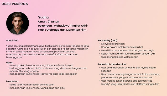
At this stage we define the problem from the results of research that has been carried out at the empathize stage and develop user persona to understand our users . Then, we create a list of paint points from user and cluster them in the form of an affinity diagram.
- User Persona
- Paint Points Participant

Define Problem & Solution
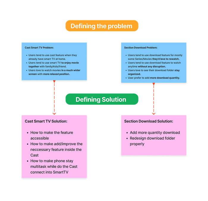
Next, we analyze every possible solution to the problem on the diagram. Then we made How Might We (HMW) to assist in making solutions in the next process.

3. Ideate
At this stage, we create a solution based on the results of HMW above.


Flowchart
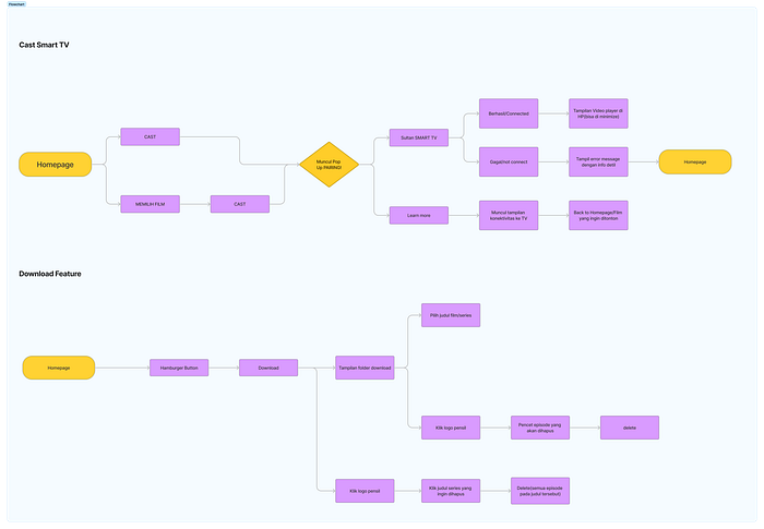
4. Prototyping
After making the flowchart has been completed, the next step is to create a wireframe.
- Wireframe

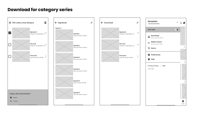

So, our blueprint already finished. Now we are heading to create the high fidelty design. But before that, we made some challenging part called style guides to help ensure consistency our design.
- Style Guide
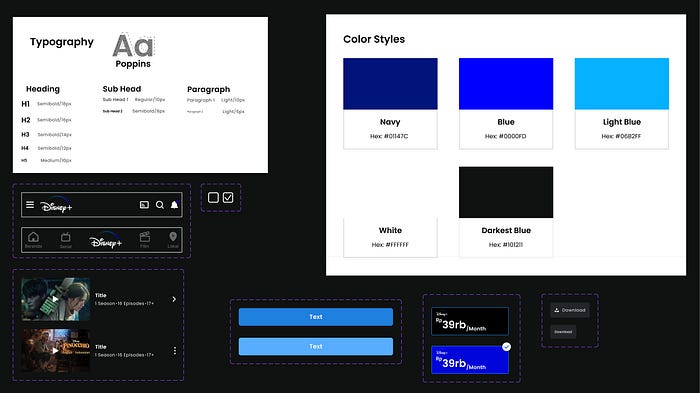
- High Fidelity Design
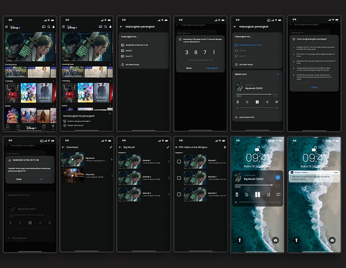
- Prototype
The screen designs already, and now we need to create a prototype so we can interact with each screen.
5. Testing
After the results of the design & prototype are completed, then we carry out a validation process to get feedback. We do some testing with a method called System Usability Testing. We carry out the testing process using the maze platform. And the result is.….. we get an average poin of 81. In terms of SUS scores, the design created is rated Good with that points.

Need a better report?🤔, You can click this.
It’s a Wrap!
Finally, I’d want to thank everyone who contributed for this challenge.
Especially for my teammate in UI/UX team rifki syahwidhie & Dwi Risma, PM teams, our mentors, and all the person who helped us.
I have learned a lot of new knowledge about problem solving, critical thinking, team work, and especially I learn about how important communication between teams is very influential and important. I hope that will make me a better UI/UX designer😊.
If you have any feedback, I really appreciate any feedback or critique come, that very helpful for my improvement. You can drop it in the comments.😄🤩🙏.
